By now, you’ve heard the statistics: By 2020, our 4.4 zettabytes of data is expected to explode to 44 zettabytes, or 44 trillion gigabytes. We have access to more data than ever, but only 1% is analyzed. And a recent Harvard Business Review study reported that 80% of a typical analyst’s time is spent discovering and preparing—not deriving insights.
Within this sea of data lies tremendous potential for optimizing a variety of key business functions. And with the rise of marketing technology, this opportunity is falling squarely on the shoulders of marketers. But far too often, data remains in a silo, making it difficult for a brand manager to keep up to date on the scope of what their BI teams, and measurement partners, are collecting and analyzing.
Enter data visualization, the practice of placing data into a visual context in order to increase understanding and clarity. Platforms like Tableau have exploded onto the scene, helping business intelligence and data science experts develop a wider scope of visuals to put meaning to their data. Given the data boom, and the potential for using insights to optimize marketing revenue, it’s no surprise that BI professionals across industries consider data visualization the year’s most important business intelligence trend.
At Mojo, data visualization is a powerful vehicle for increasing our clients’ understanding, and interaction with, our in-depth insights. Not surprisingly, we’ve seen a significant uptick in the number of Mojo’s pharma marketing clients who request data visualization and prefer it over traditional data representation.
Here are a few points we consider when developing visualizations for our pharma brands.
Data visualizations should be proactive and interactive
Every person learns differently. However, a well done visualization makes it obvious to the client how to respond or what to do next. One of the key charts we us at Mojo is a direct comparison across different online advertising (OLA) locations—a visual that makes it immediately apparent where the outliers are and what questions need to be asked.
The best data visualizations aren’t reactive, but proactive and interactive. Like our OLA comparison, data visualizations should anticipate the needs of brand teams. One way we do this is by establishing key business questions at the start of our measurement efforts. These pre-determined questions allow our team to hone in on the areas where insights will drive the biggest results, and showcase these opportunities in a visual form.
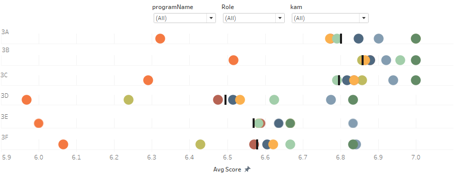 This visualization was designed to provide insight into performance by KAM (Key Account Manager) as well as by program and gives insight to the overall KAM team Average performance as ranked by HCPs. This includes information on 14 different KAMS providing 8 different programs (depicted by colors) and scored on 6 different items regarding the program (3A thru 3F). End users can filter by specific program, specific KAM, and the role of the different program attendees (HCP, admin, etc).
Even the most well-constructed house will crumble without a strong foundation. Likewise, data visualizations are only as effective as your underlying methodologies. We provide a tremendous depth and breadth of data-driven insights using robust measurements such as descriptive and exploratory data analysis, regression (multiple and logistic), group means testing (t-tests, ANOVA models and beyond), segmentation (CHIAD and decision tree modeling), Chi-Square and economic analyses (ROI).
The list goes on and on—but you get the picture. The more robust your data foundation, the more insights you can derive and the more meaningful your visualizations become.
The shift from traditional data representation to a more user-friendly visual delivery allows us to provide a wider scope of data for our clients in a way they can understand. However, focusing the data where it matters most takes a complex skillset, a user-experience mindset and a strong measurement foundation. The quality of your visualization is only as strong as the data and insights you put into it.
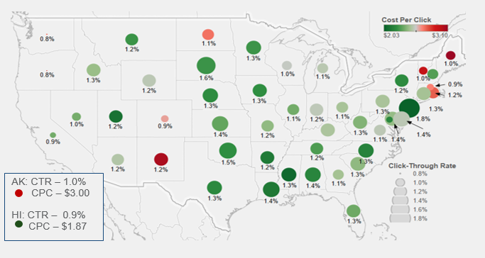 This visualization was designed to show the performance of a paid search campaign by state. This includes information for all 50 states and captures both the Click Through Rates (depicted by circle size) and the Cost Per Click (depicted by circle color). This allows the end user to review performance in various areas and optimize their spend according to brand plan and observed performance levels.
Improving the customer journey
With so much focus on customer experience and what that looks like, a challenge many pharma brands face is how to intuitively represent the customer journey in a clear way that directs a brand’s action.
In today’s marketing landscape, physicians and patients have more touchpoints with pharma brands than ever before. Understanding the 360 journey is a complex undertaking that requires marketers to digest and implement data-driven insights at stages from discovery to brand loyalty. We’ve found that visualizations help clear the confusion on the many stages, touchpoints and tactics in a brand’s customer journey. Visual tools help data scientists cut through the data clutter to the most important insights—and highlight specific actions that will boost the journey.
Data visualization is an invaluable vehicle for bridging the gap between measurement teams and marketers. But as is the case with data itself, visualizations don’t mean a thing if you don’t know how to use them properly. High-quality data visualizations require a robust measurement model, in-depth expertise and the ability to transform data into actionable insights.